
Introduction
A splendid hilltop house in Valpolicella, prototypical of the region’s architectural identity. A residence immersed in the landscape, with the valley stretching below and the hillside rising behind, enjoying a 180-degree panoramic view over the city of Verona.
The project was conceived through a pure, simple, and minimal design, where every decision is measured and each detail becomes a deliberate architectural statement, balancing the natural context with a contemporary language.
Design
The design is defined by a rigorous geometric language in the forms, furnishings, and added elements, maintaining a coherent and controlled aesthetic. At the same time, it becomes sinuous and harmonious, following the curves of the house and adapting to both the architecture and the surrounding landscape.
The entire project was developed by architect Luca Zanaroli of Bologna, who led the concept with a clear vision, combining formal discipline with spatial fluidity.
"
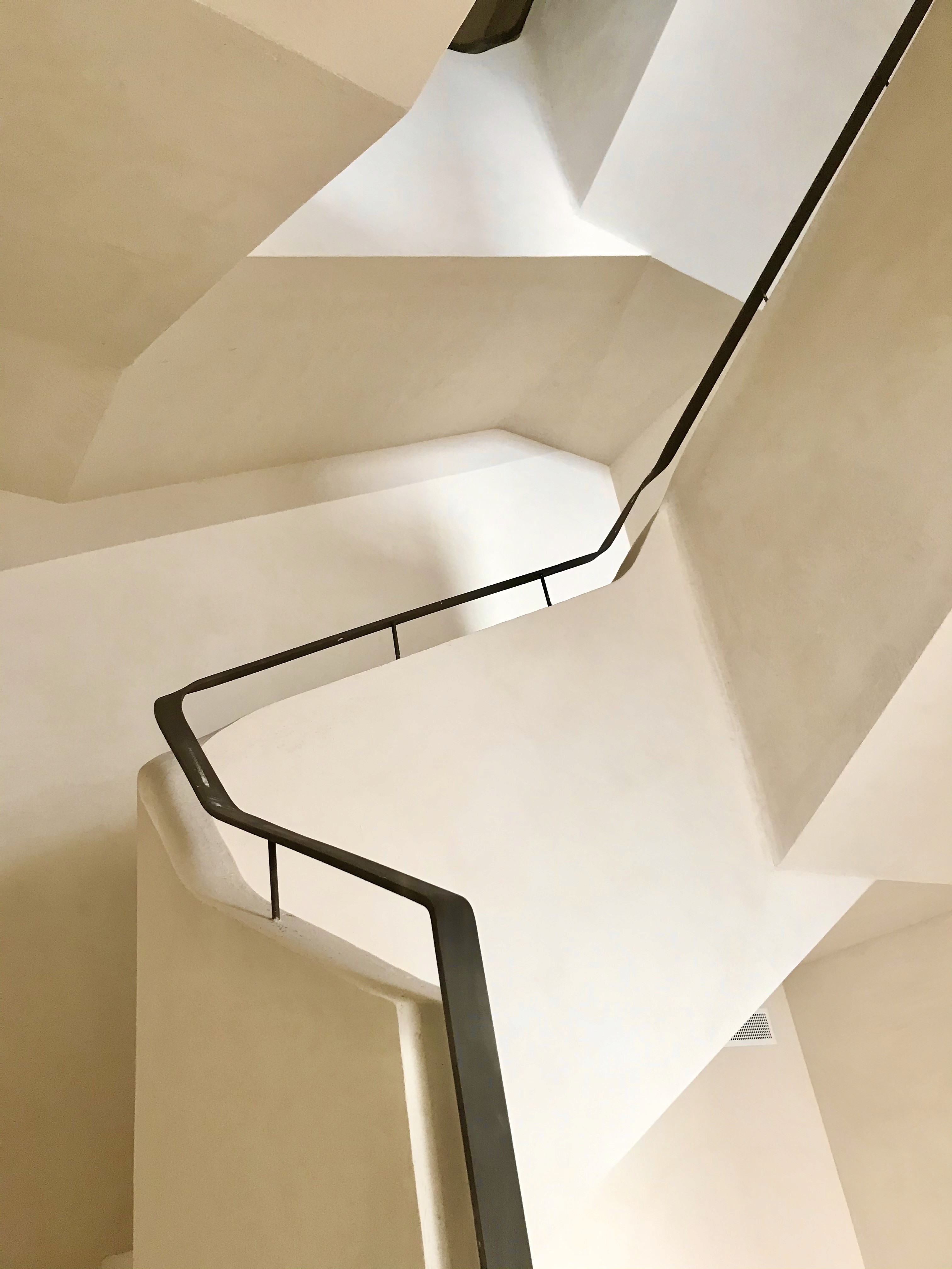
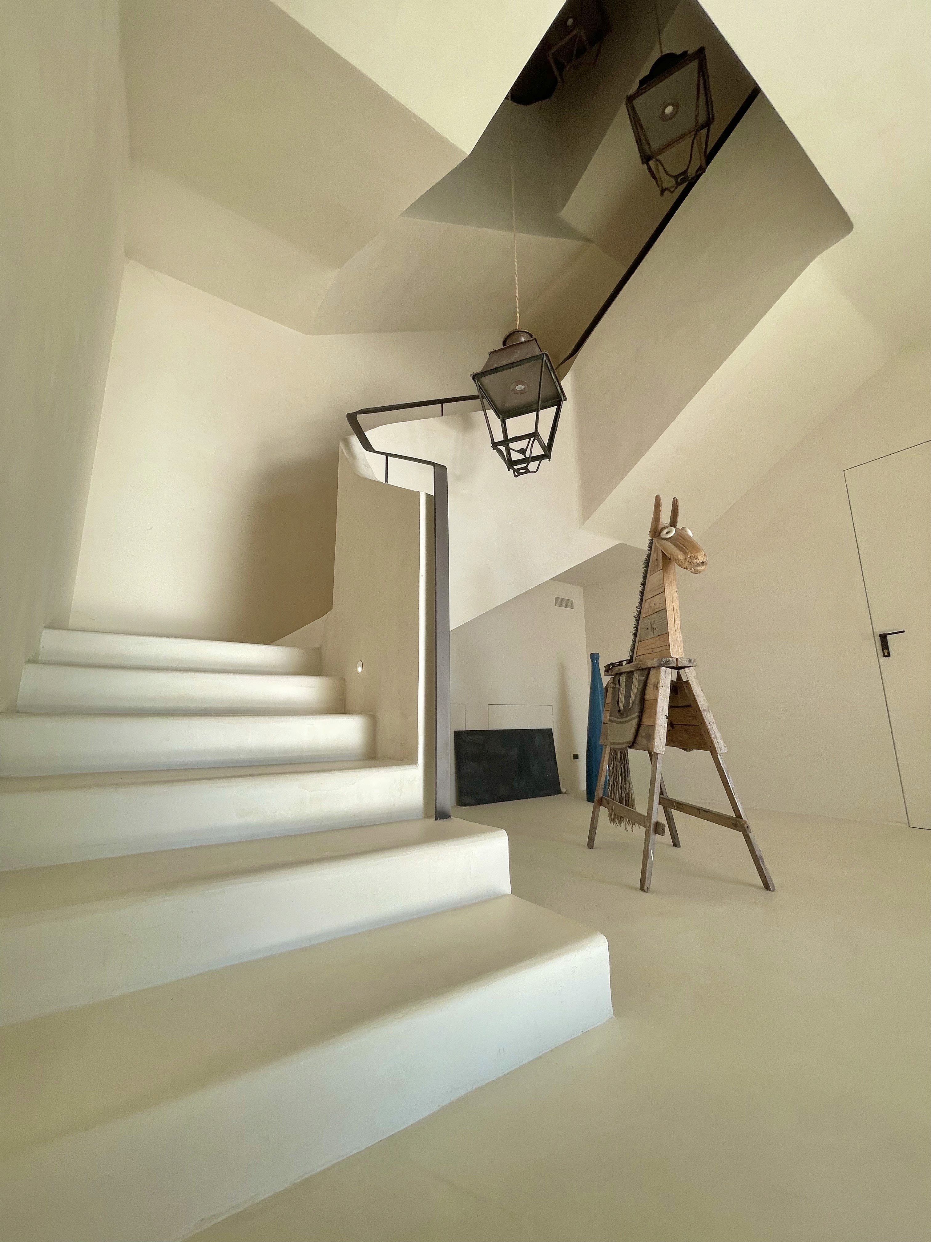
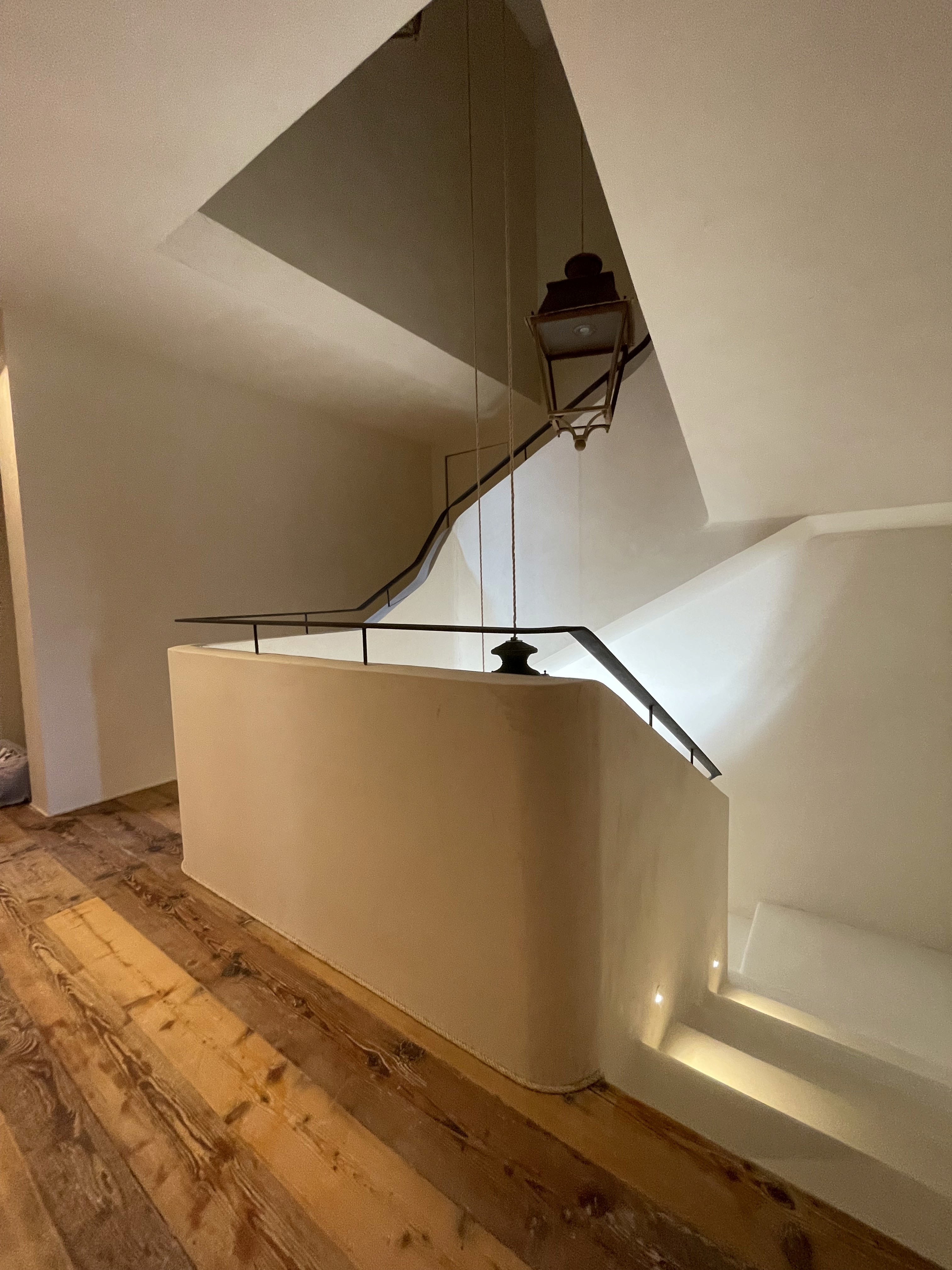
Steel bends into gesture: a ribbon guiding the hand and the ascent.
Detail 1
The ribbon handrail, designed by architect Zanaroli, stands out for its linear continuity and the minimal gap from the wall. A very thin separation between masonry and steel creates a cut of light, enhancing the lightness of the gesture and transforming a functional element into an essential architectural sign.
"
Rigorous lines that capture the eye through quiet precision.
Detail 2
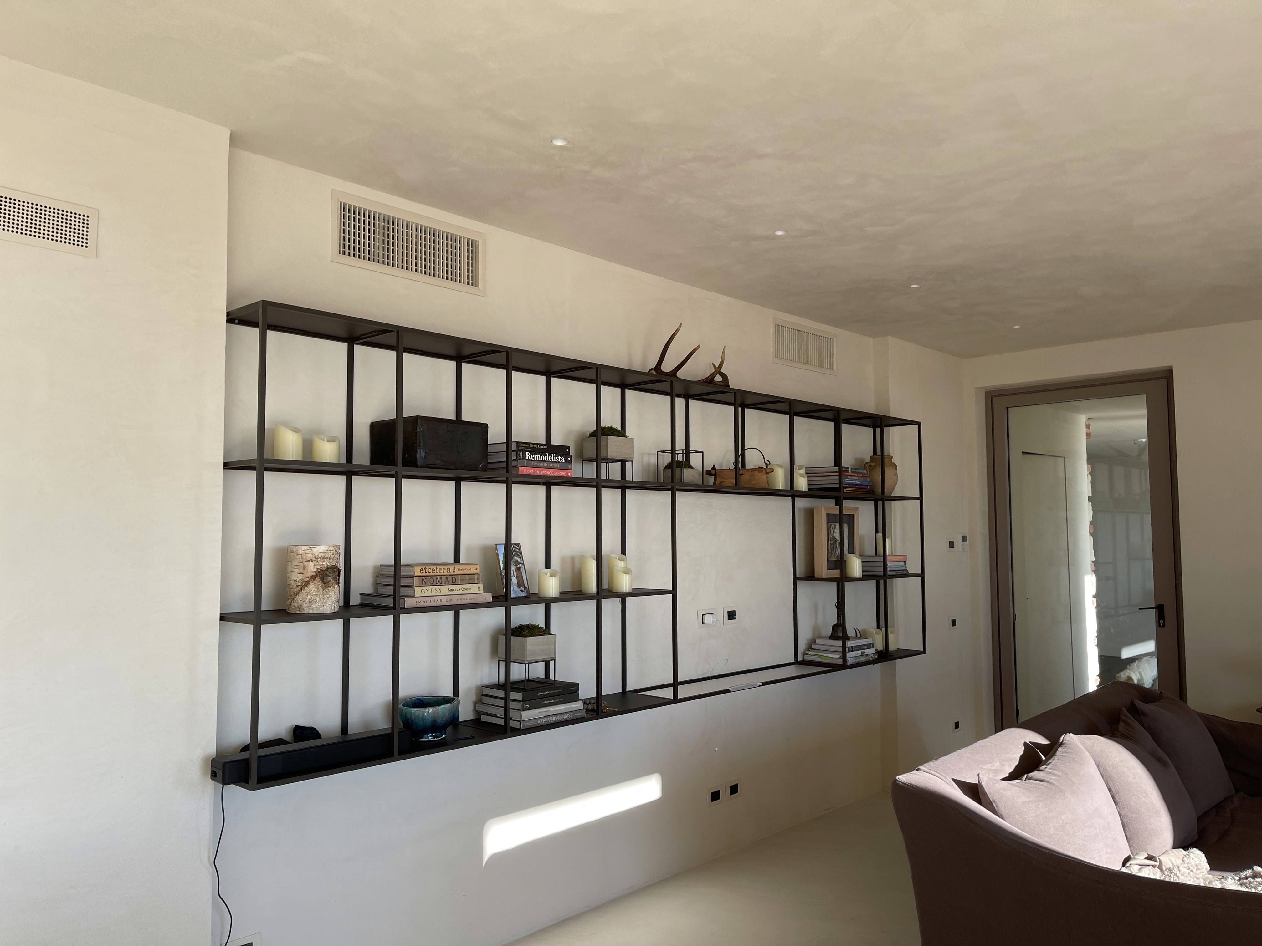
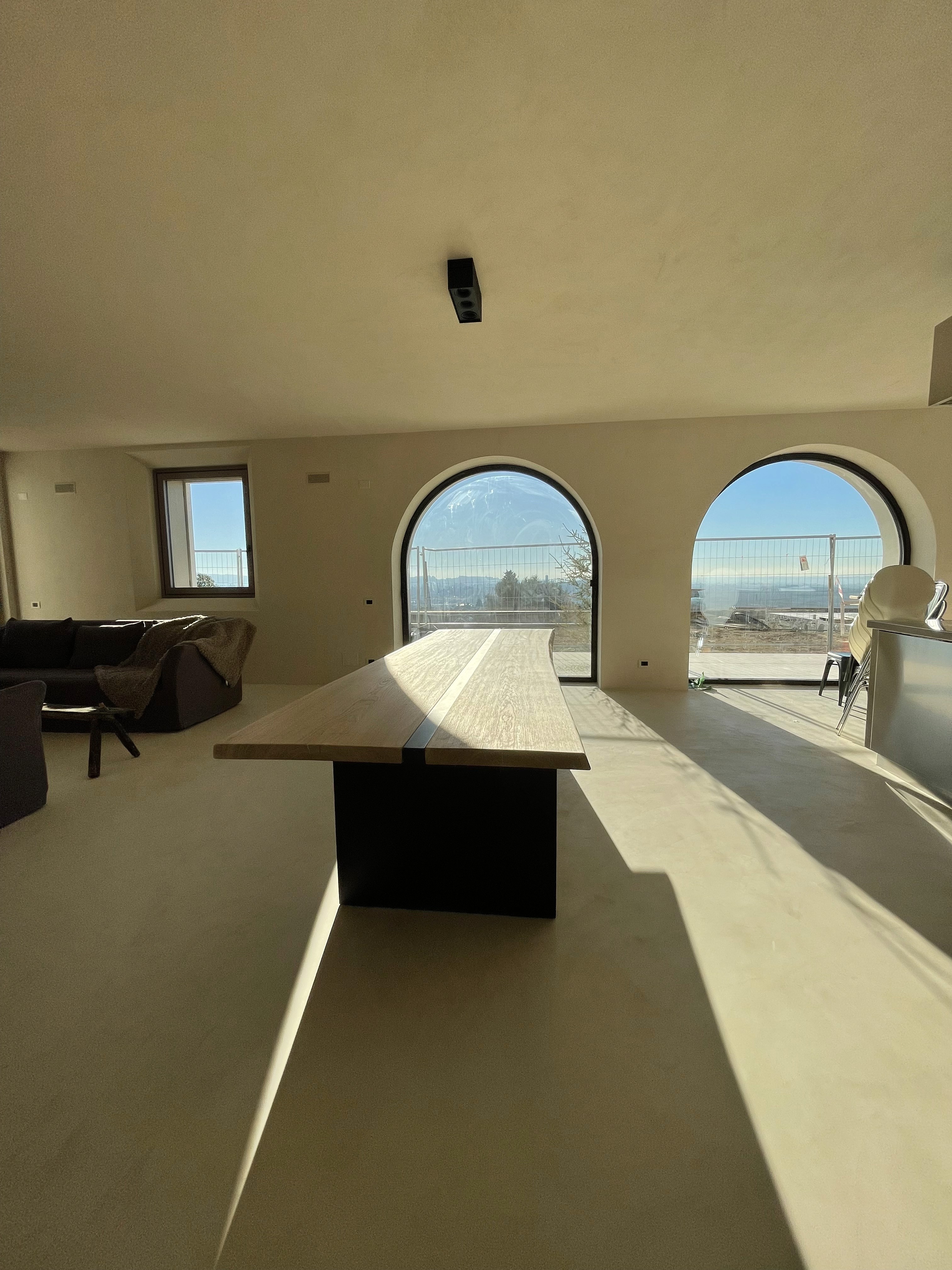
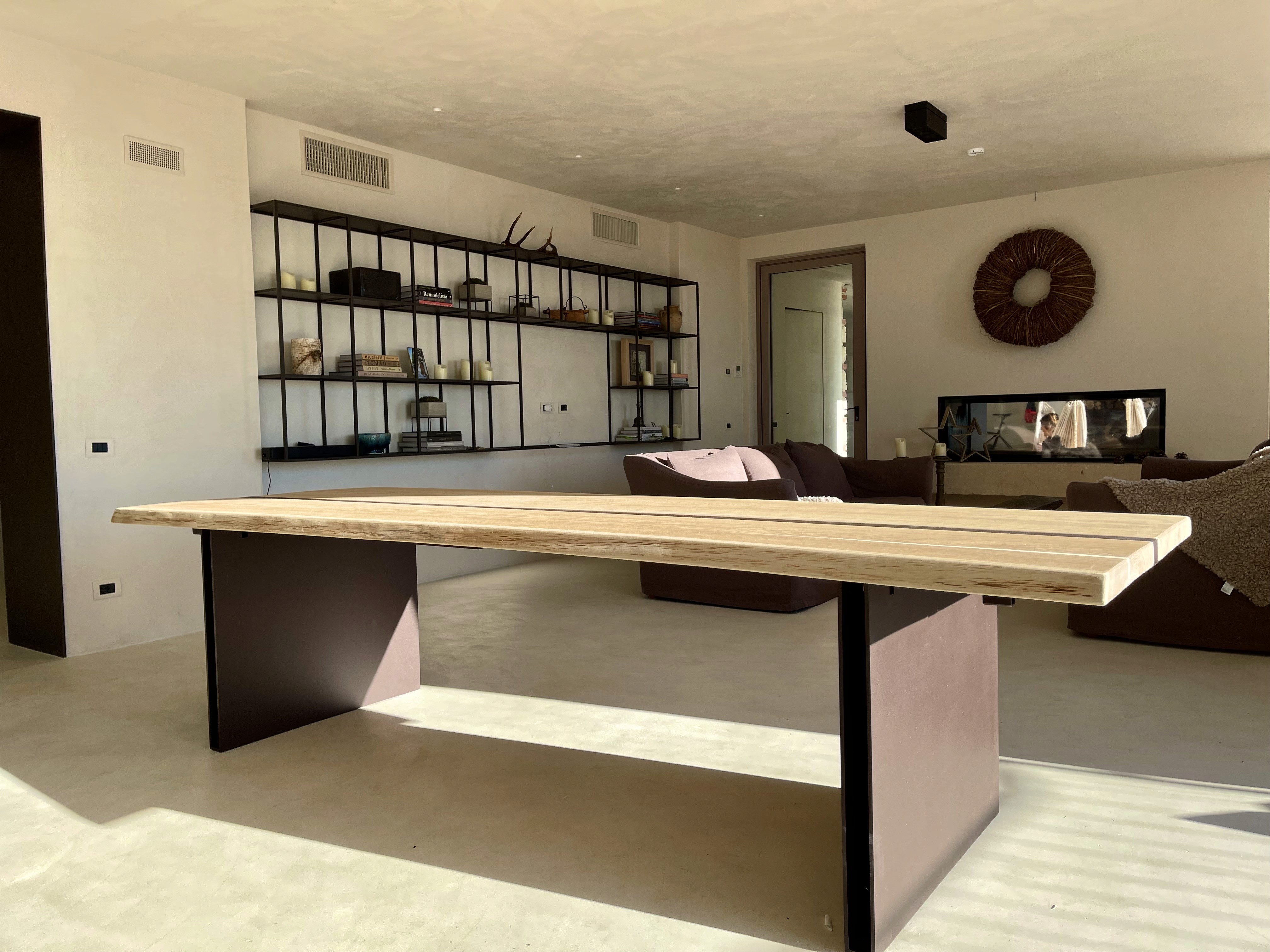
The minimalist statement table echoes the project’s language through square steel plate legs and a natural solid wood top. A central split, crossed by a steel insert, recalls the material of the base, establishing material continuity and formal coherence.
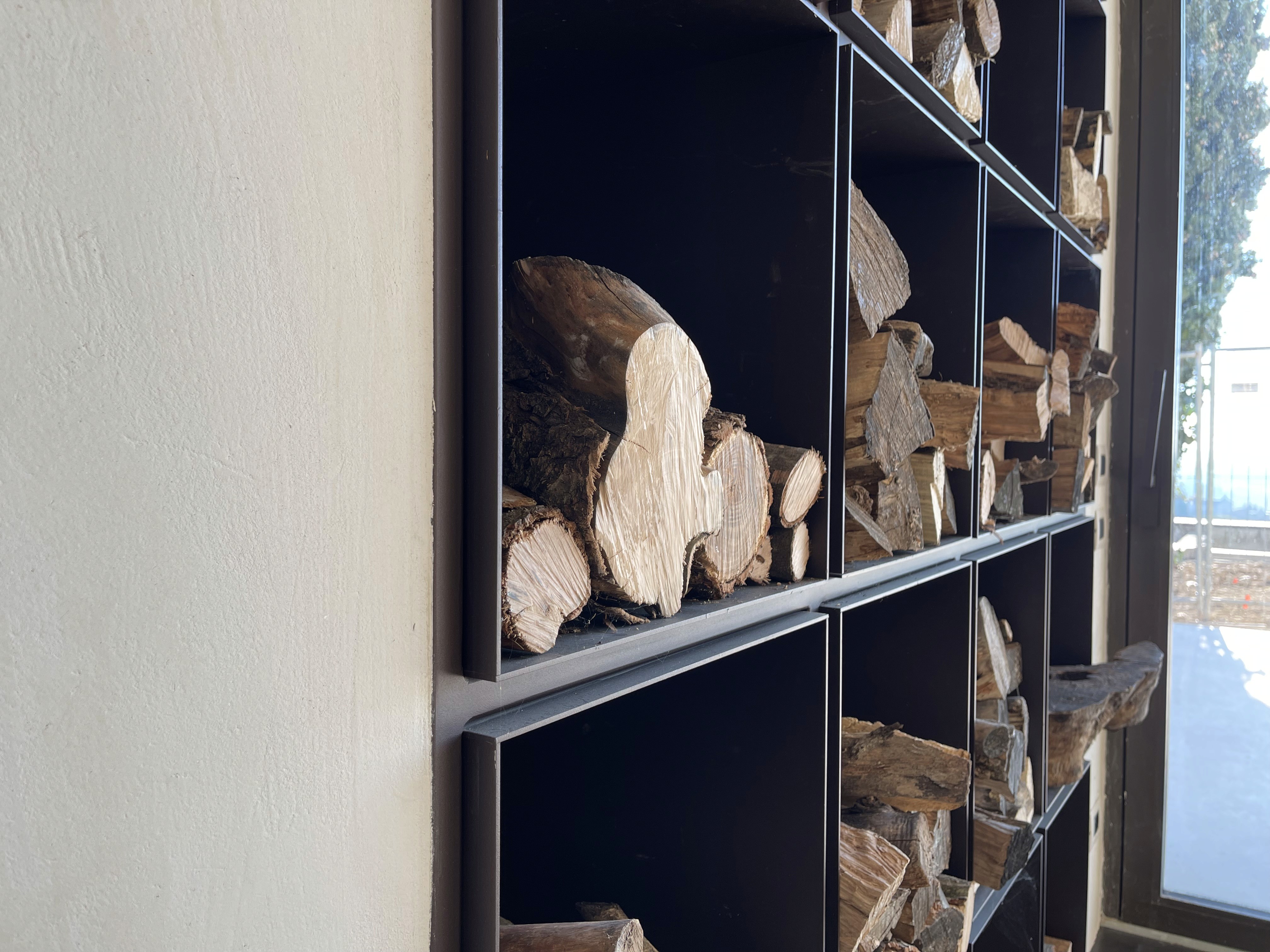
The wood storage area also reflects the project’s geometric discipline. The angular steel section slightly protrudes from the square cells, creating an effect similar to a tight geometric bas-relief, minimal and controlled, fully aligned with the architectural language of the house.

Finishes
The finish was developed in relation to the home’s overall color palette. A single tone was selected, based on a warm brown foundation, intentionally more pronounced to create contrast and highlight all steel details.
The entire residence is defined by a hazelnut tone, blending walls, resin floors, and ceilings into a seamless and enveloping environment. The chosen brown for the metal elements introduces a warm yet distinct note, enhancing the iron features without disturbing the overall spatial balance.

Conclusion
The house takes shape through a continuous exchange of light between interior and exterior, enhanced by large glazed openings that illuminate and emphasize every detail. The table, the steel legs, the minimal staircase, the wardrobe handles, and the descending handrail become subtle yet present elements, revealed by natural light.
A delicate harmony is perceived between the rounded architecture and the defined contrast of steel, which seems to embrace the house without overpowering it. A measured balance where material, light, and form coexist naturally and coherently.

